


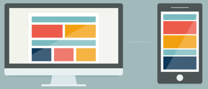
Responsive Email Design helps to send templates that can change depending upon the screen size they use. These emails always render correctly regardless of the device it is viewed on. As more web traffic continues to move to mobile, designing sites and experiences for different sized screens become more important. They use CSS media queries to produce two different copies that depend on the size of the user’s screen. Media queries will automatically adjust the emails copy layout, content and text size to the user’s device screen. There are more efforts required at the outset, but a good template should last for a time.
The trend towards Responsive Email Design began way back in 2010. Responsively designing began with the use of fluid grids, flexible images, and media queries and soon these CSS elements were welcomed into inboxes. They are all about providing content that is customized for users’ chosen devices.
” Design once, view appropriately everywhere.
What a great idea! “
2 types of responsive email design and best practices
2 Types of Responsive Email Design can be made in two ways:
It consists of a few different components: a few layouts that are often a single column scalable for all sizes large, attention-grabbing text, clickable call-to-action buttons. We can use this format to change with a minimal amount of coding effort.
It makes use of percentage-based sizing to automatically adjust the width of tables and images to the device’s screen size. We can use this format if we are not afraid of extra white space around the edges of our content.
Responsive Email Design Best Practices:-

- Stick to a single column layout. Less shifting and moving makes it easier for the audience to read the content.
- At a minimum, use 13-14 pt font for the body text and no smaller than 20 pt for the titles. This will make our email much more readable on a small screen.
- Place the most important call to action the most important information “above the fold”. It means the most important content readily available without making the audience scroll and finds it.
- Use smaller responsive images and make sure to use alt tags in case email client doesn’t load the images. This is also a best practice for accessibility.